Seeking Balance and Calm Through Colour
COVID-19 restrictions have led to many of us spending more time than ever at home, which has created a growing interest in finding ways to make our homes a ‘sanctuary’ from the world around us. At the same time, our homes are increasingly needing to be more multifunctional (home office anyone?), and this, combined with the fact that we are spending less time outdoors, in nature, has left many with a desire to refresh their home surroundings and make their spaces better suited for the times we’re living in.
COLORBOND® steel Colour and Design Consultant, Alison Fenton is finding that during these unprecedented times, people are wanting to create places where they feel relaxed; “With the constantly changing and unsettling conditions around us, there is a trend towards creating grounded, supportive and peaceful environments, where a person can relax and feel a sense of calm.”
Warmer colour palettes that include pale naturals, soft blush undertones, soothing warm greys and gentle greens are ideal for creating a peaceful space and COLORBOND® steel includes many options that fall within this spectrum.
Says Alison, “Colours such as COLORBOND® steel Shale Grey™, COLORBOND® steel Evening Haze®, COLORBOND® steel Surfmist®, COLORBOND® steel Paperbark® and COLORBOND® steel Wallaby® are all fresh yet comforting hues. And these warmer palettes coordinate
beautifully with the softening of hard edges, inclusion of organic sculptural forms and gentle, rounded furnishings to achieve an overall flow of calm energy from outside to in.”
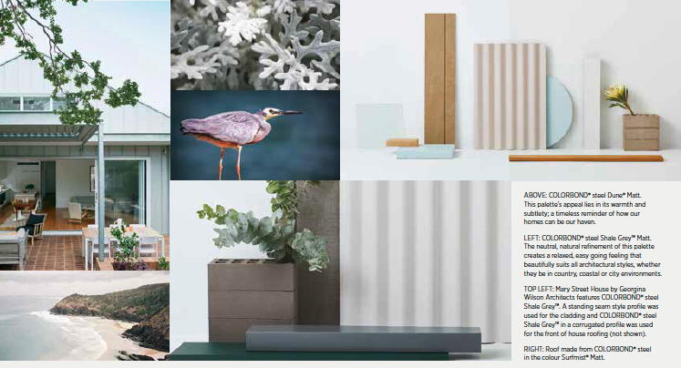
COLORBOND® steel Dune® and Woodland Grey® are other sought-after colours in the range with a natural fit in these softer, calmer spaces.
Says Alison, “When choosing a colour like COLORBOND® steel Dune® you’re connecting with the dusty earth of the Australian bushland, the soft pelt of native marsupials, and the textured landscapes of granite rock and stone. While COLORBOND® steel Woodland Grey® draws from the depth of a cool green forest, the canopy of eucalyptus on a rugged mountain plateau, and the mossy boulders and ferns found in mountain crevices.”
Another consideration, beyond colour, is texture, and matt finishes in particular, have become increasingly popular due to their warm and luxurious feel.
By diffusing the light for a subtle, contemporary effect, COLORBOND® steel Matt delivers this matt look and feel, with sophisticated confidence. And the matt range includes some of the most popular nature-inspired colours, including Dune® Matt and Shale Grey™ Matt.
Whether you are looking to undergo a small update to your home, or a full-scale renovation or build, see more inspiration at colorbond.com or on Instagram and Pinterest.
The COLORBOND® steel images shown here have been reproduced to represent actual product colours and finish as accurately as possible. However, we recommend checking your chosen colour against an actual sample of the product before purchasing, as varying light conditions and limitations of the printing process may affect colour tones and finish. To determine the most suitable material for your project, please contact your builder or see colorbond.com. COLORBOND®, BlueScope, the BlueScope brand mark and ® colour names are registered trade marks of BlueScope Steel Limited. TM colour names are trade marks of BlueScope Steel Limited. © 2020 BlueScope Steel Limited. ABN 16 000 011 058. All rights reserved.